A Pipeline funnel chart demonstrates data flow through a linear, sequential process within a sales pipeline. They help readers quickly make sense of data and are often used by organizations to identify potential problems within a process. They also help organizations take quantified measurements of conversion, churn, and sales rates. - MindManagers
.
Funnel charts are usually seen in business or sales contexts where a set of consumers or users have a general flow or process that they follow through multiple stages. Funnel charts are useful across various industries for visualizing processes that involve sequential stages, particularly where there is a progressive reduction in the number of items at each stage. Here are some examples of how funnel charts can be used in different industries:
- Sales Pipeline Analysis: Organizations can use funnel charts to calculate potential revenue, sales figures, and retention rates. Tracking the conversion rates from leads to closed sales, showing stages like initial contact, qualified leads, proposals, negotiations, and final sales.
- Marketing Campaigns: Measure the effectiveness of marketing campaigns by tracking the journey from campaign impressions to clicks, sign-ups, and purchases.
- Customer Purchase Journey: Visualize the stages from website visits to product views, cart additions, checkouts, and completed purchases, identifying where potential customers drop off.
- Recruitment Process: Monitor the stages from job postings, application submissions, interviews, offers, and hires. etc.
.
Is Power BI Funnel Chart the same as Pipeline Funnel Chart?
.
Yes, they perform same function and applicable to achieve business objectives, but in term of visual communication, Pipeline Funnel Chart helps the audience to comprehend information better.
.
How to create a pipeline funnel chart with Visual Calculation
.
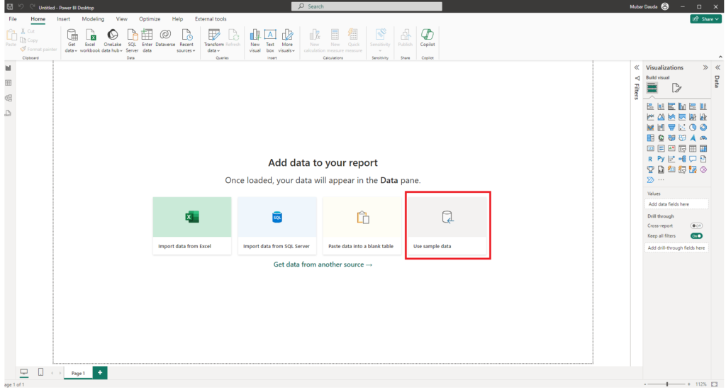
To create a pipeline funnel chart, we will be using the Power BI Sample data available here or get it through the Power BI report canvas.
.
.
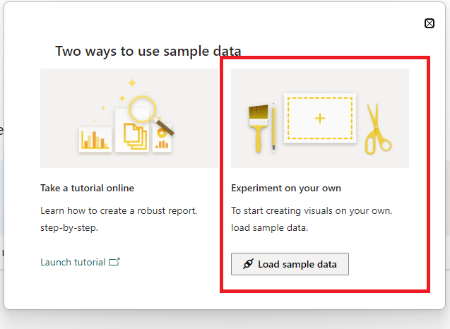
Once you click on Use Sample Data, you will see a prompt window. Then click on the Load Sample Data
.
.
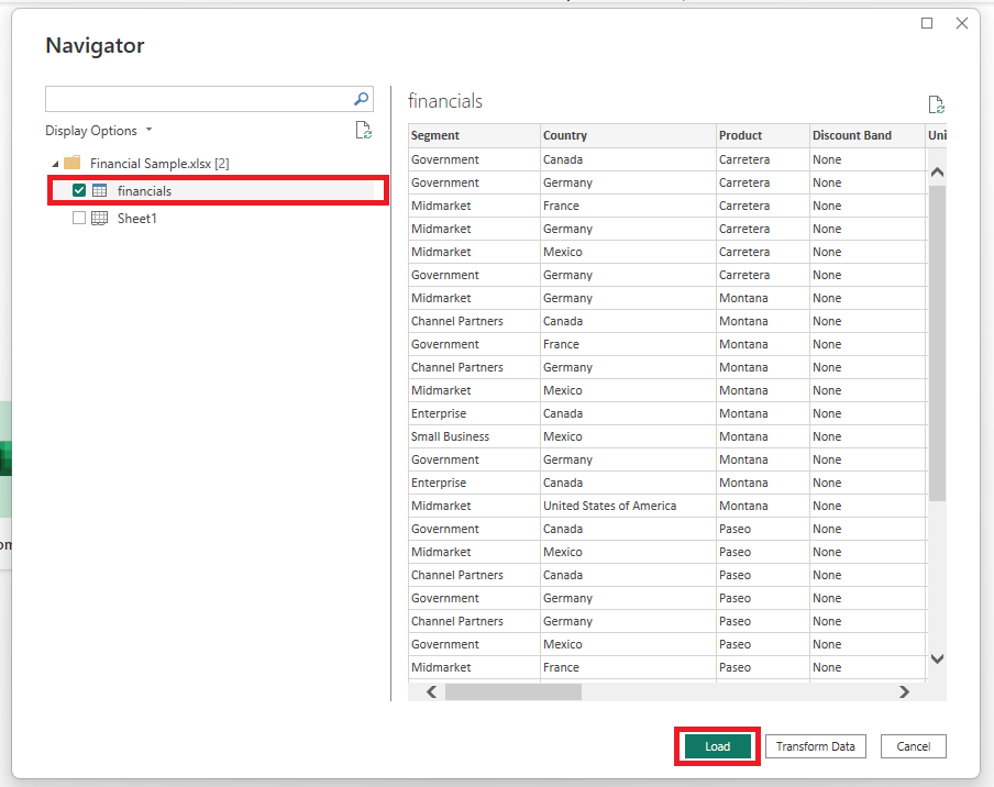
Select financials and click on Load, to load it to your Power BI model
.
.
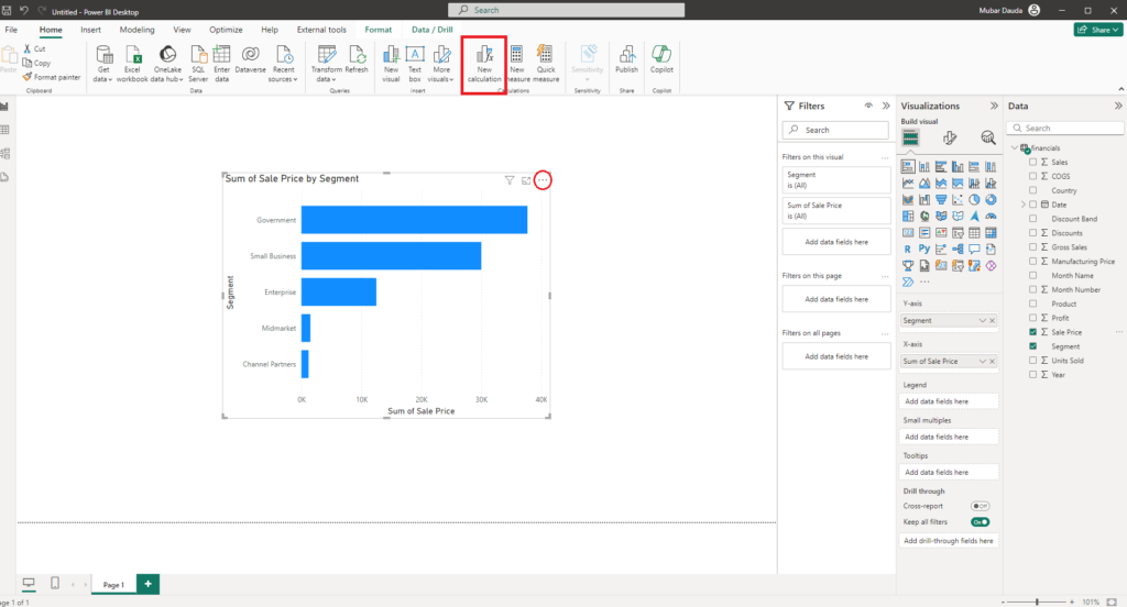
Select the stacked bar chart from the visualization pane, place the segment on Y-axis and Sales Price on X-axis
.
What is Visual Calculations in Power BI?
.
A visual calculation is a DAX calculation defined and executed directly on a visual. Visual calculations make it easier to create calculations that were previously hard to create, leading to simpler DAX, easier maintenance, and better performance.
.
A calculation can refer to any data in the visual including columns, measures, or other visual calculations. This ability removes the complexity of the semantic model and simplifies the process of writing DAX. You can use visual calculations to complete common business calculations such as running sums or moving averages.
.
Visual calculations differ from the other calculations options in DAX:
- Visual calculations aren't stored in the model, and instead are stored on the visual. This means visual calculations can only refer to what's on the visual. Anything in the model must be added to the visual before the visual calculation can refer to it, freeing visual calculations from being concerned with the complexity of filter context and the model.
- Visual calculations combine the simplicity of context from calculated columns with the on-demand calculation flexibility from measures.
- Compared to measures, visual calculations operate on aggregated data instead of the detail level, often leading to performance benefits. When a calculation can be achieved either by a new measure or a visual calculation, the latter often leads to better performance.
- Since visual calculations are part of the visual, they can refer to the visual structure, which leads to more flexibility.
.
Click on New Calculation at the top ribbon or click on the ellipses at the top right of the visual and select New Calculation to activate Visual Calculations in Power BI.
.
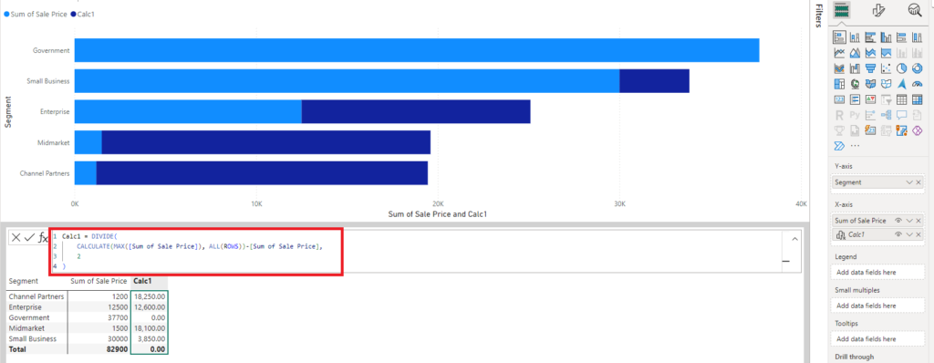
Now we need to create a visual calculation to center the sales price values in the middle of a stacked bar. How to do that is to subtract the maximum sales price for each segment from the other segments and divide it by 2.
.
calc1 = DIVIDE(
	CALCULATE(MAX([Sum of Sales Price]), ALL([ROWS])) - [Sum of Sales price],
	2)
What these does is to pick the maximum sales price from the sum of sales price column where no filter should be applied to it from other columns and subtract the respective column value from it and divide the result by 2 that's the Calc1 column return as seen below. (so, the abstract calculation was it pick 37700 and return same thing across for the new column, then subtract the sales price from the 37700 then divide the answer by 2).
.
.
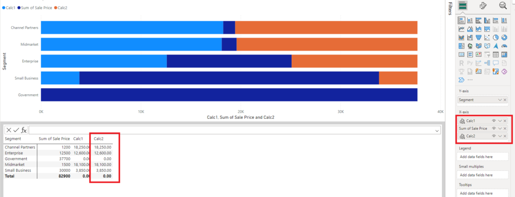
Repeat the same step for the Calc2, align the values on the X-axis as seen on the visualization pane. These helps by centering the Sales Price value.
.
.
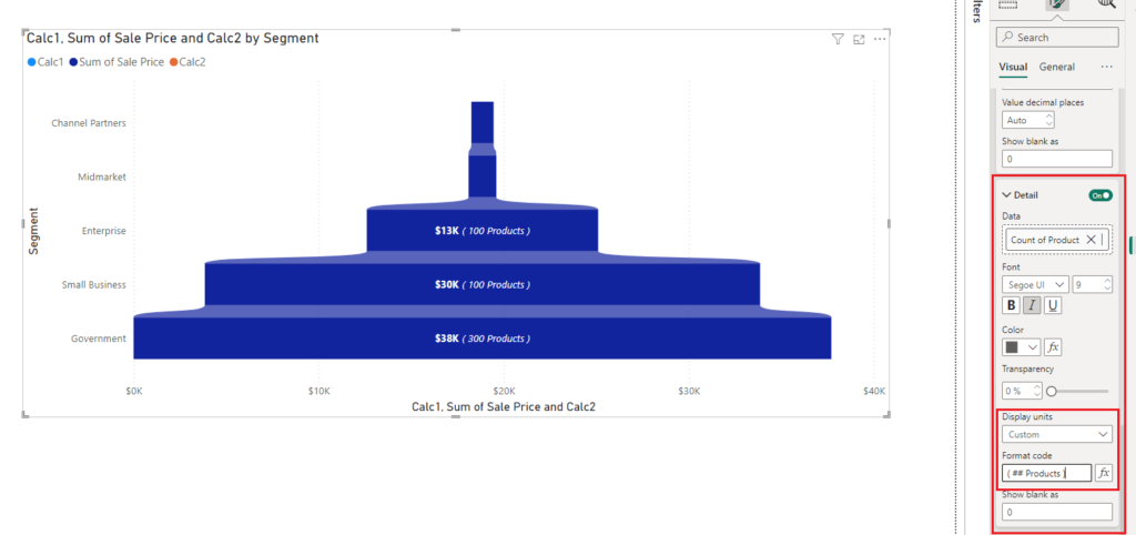
Now let's format the chart, Go to the format pane >>> Expand the Bars >>> from the series, select the Calc1 and set the transparency to 100. Repeat the same for Calc2
.
.
Then enable the Ribbons and set the transparency for Calc1 & Calc2 to 100 respectively.
.
.
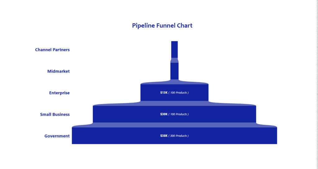
Now we have the Pipeline Funnel Chart, you can customize the data labels using the value and details option as seen below.
.
.
We have successfully created a Pipeline Funnel Chart using Visual Calculations in Power BI.
NB: You can do the same using stack column chart if you want vertical view.